SelectPanel
The SelectPanel is an anchored dialog that allows users to quickly navigate and select one or multiple items from a list. It includes a text input for filtering, supports item grouping, and offers a footer for additional actions. Changes are applied upon closing the panel.
Page navigation navigation
Anatomy
 Edit in Figma
The SelectPanel can be implemented as either an anchored nonmodal or a modal. The nonmodal variation saves the user's
selections automatically. Clicking outside or pressing esc will close it. The modal variation includes Save and Cancel
buttons, which are required to close the modal.
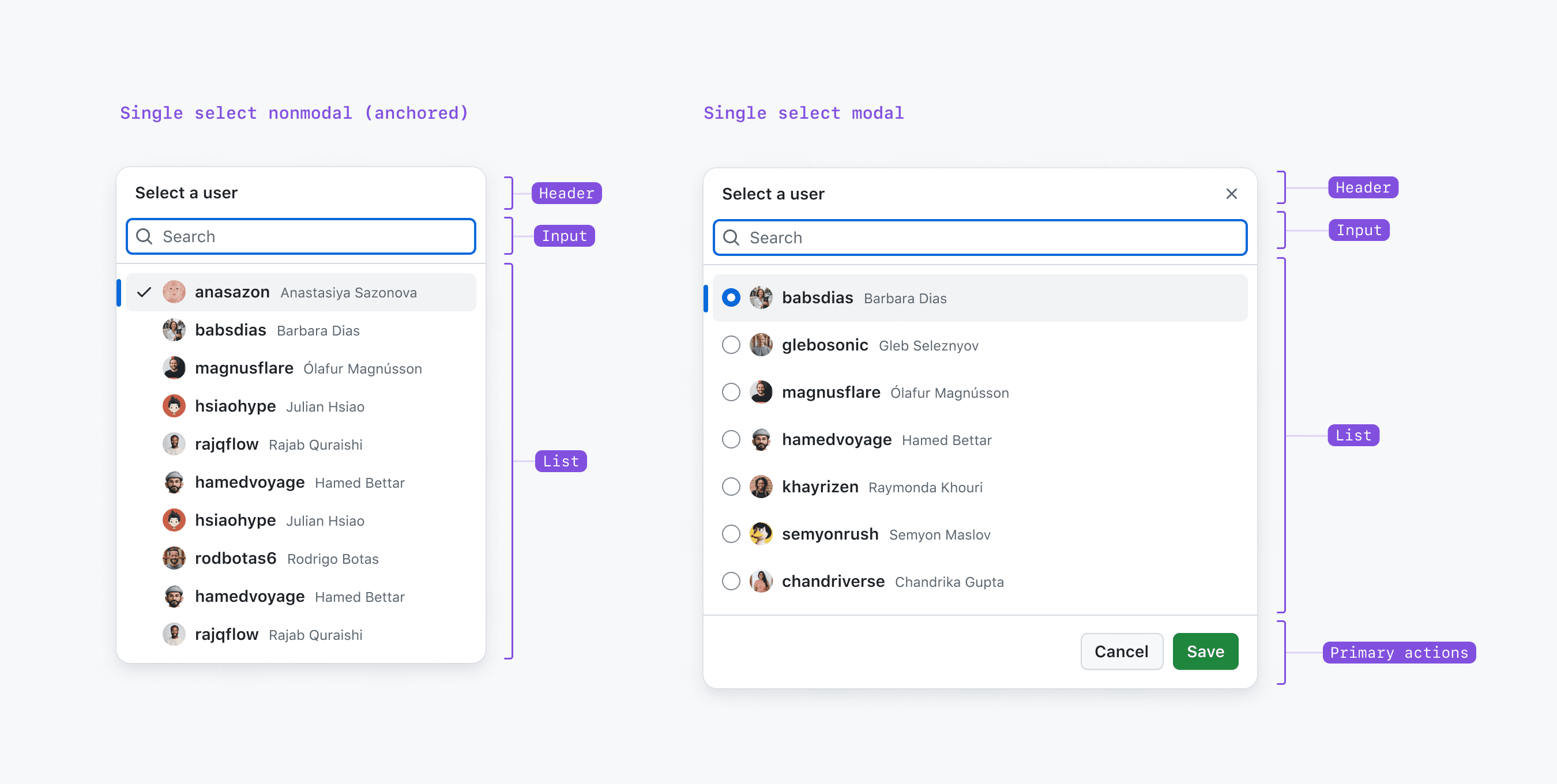
The SelectPanel consists of three main areas: a header, a scrollable list that can be filtered, and an optional footer:
- Header: Includes a title, subtitle (optional), and a close button.
- Input: The input field allows users to quickly filter the list.
- List (scrollable): The scrollable list contains ActionList items, which can be either single or multi-select options.
- Footer: For the nonmodal version, the footer can include a link or button for additional actions. For the modal version of the SelectPanel, the footer includes primary actions (Save and Cancel button) with an optional secondary action if needed.
Options
Single Selection
 Edit in Figma
For single-item selection, the panel closes immediately upon selection. The selected item is indicated by a checkmark.
Multi Selection
 Edit in Figma
For multi-item selection, the panel remains open after each selection, allowing users to choose multiple items before closing the panel to confirm their choices.
Groups
Items can be grouped to provide additional context or to visually separate them. Each group can have a title for better organization.
Footer
 Edit in Figma
The bottom portion of the SelectPanel (the footer area) can include a link or button for additional actions. For the modal version of the SelectPanel, the footer includes primary actions (Save and Cancel button) with an optional secondary action if needed.
Opening
 Edit in Figma
Select panels can be activated via a semantic button, which can be either a regular button or an icon button. If the button represents the current selection, it must have an associated label, either internally (within the button) or externally (adjacent to the button).
Best practices
Current Selection
 Edit in Figma
To make the current selection clear, the selected items are displayed at the beginning of the list. This behavior should occur when opening the select panel, or after users clear the input. Avoid reordering items after selection to prevent disorientation.
Error/Warning Handling
 Edit in Figma
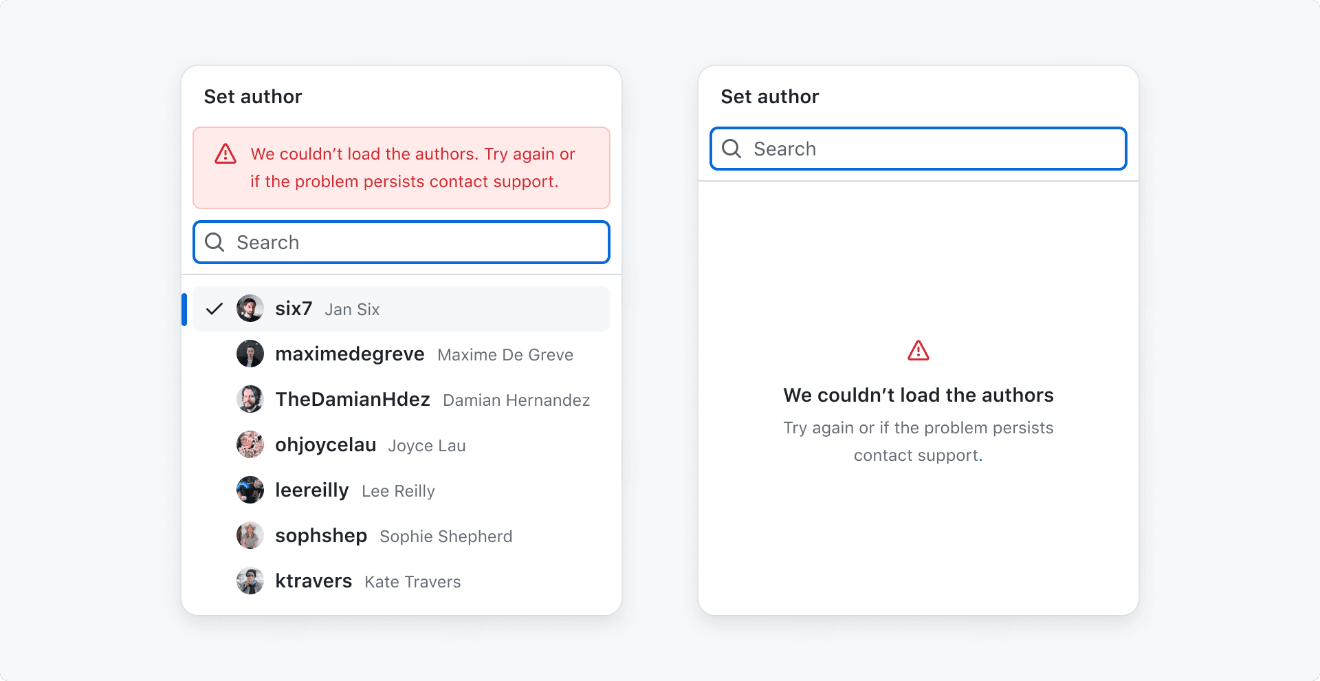
A notice should be applied via the notice and message props when things don't work as expected, or users need to
be informed about important issues. If default values fail to load, we display an error placeholder to inform the user.
When users search for new values and the search fails, we display an error message above the input. See notification
messaging for more information.
Behavior
The select panel opens when the trigger button is activated by a click, Enter, or Space.
Interactions
Focus is initially placed on the input field and the first item in the list, which are connected as one focusable entity. Users can type to filter the list or navigate using ArrowUp and ArrowDown.
Apply Changes
Nonmodal version: Closing the select panel applies all changes. It can be closed by clicking the trigger button again, clicking outside the panel, or pressing the Esc key.
Modal version: The primary action button (Save) applies all changes and closes the panel. The secondary action button (Cancel), or the x button, closes the panel without applying changes. The select panel can be closed by clicking the cancel button, the x button, or pressing the Esc key.